Right-Click Anywhere: A RUST-Style Navigation Wheel for VAGA
Right-Click Anywhere: A Rust-Style Navigation Wheel for VAGA
VAGA's navigation has always been Odoo-style: a home screen with a grid of app cards: Drive, Inventaire, Trésorerie, Fournisseurs, Clients, Achats, Ventes, Retenue à la Source, and so on, and clicking one takes you into that module. There was never a sidebar. Which meant switching between two modules had one fixed cost: go back to the home screen, re-scan the grid, click the next card. For an app people live in all day, that's a lot of round trips through a screen you don't actually want to be on.
The fix borrows a pattern that has nothing to do with business software: the radial menu from Rust's building wheel.
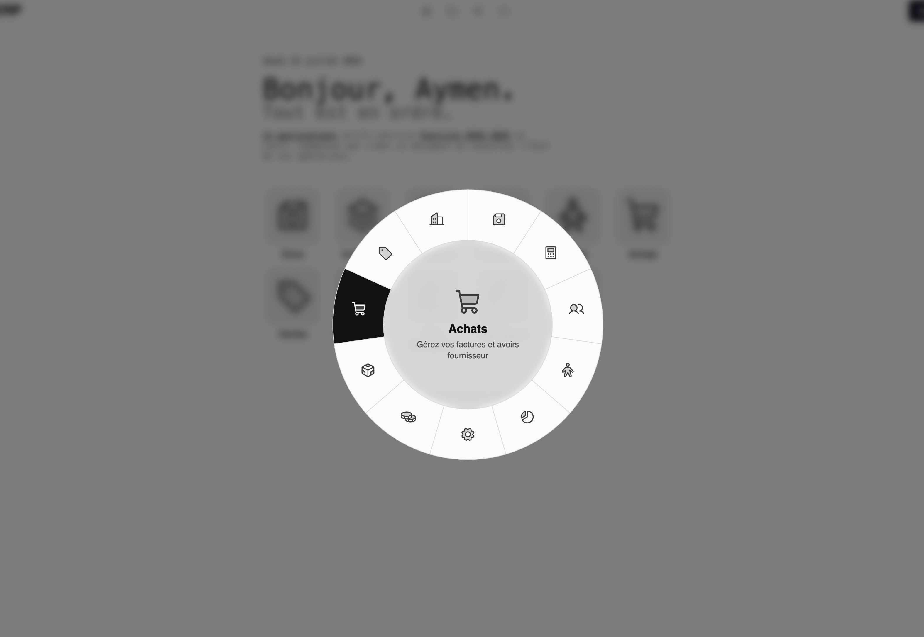
Right-click anywhere, a donut-shaped menu pops up centered on screen, click a category to drill into its children, click a leaf to navigate. No trip back to the home grid, no re-scanning eleven cards to find the one you need.
Adapting a game pattern to a form-filling app
Games get away with things an ERP can't. Rust's wheel is hover-and-release, you hold the button, sweep the cursor over a slice, let go. That's fine when the input is a mouse held for the duration of a menu and the stakes of a mis-click are low. In an app where the same right-click also needs to paste into a text field, and where users aren't necessarily reaching for twitch-reflex interactions, that model doesn't transfer directly. So the wheel here is click-based instead: click a category to morph the ring into its children, click a leaf to go there and close. Slower than a game menu, but predictable, which is what you want when the next click might submit an invoice.
A few other places where "what would a game do" got overruled by "what does an ERP actually need":
The wheel never follows the cursor: It always spawns centered on screen, whether triggered by right-click or by the keyboard shortcut. Rust clamps its wheel to stay on-screen near the cursor; VAGA just skips that problem by not trying to position near the cursor at all.
Right-click is hijacked everywhere except editable fields: input, textarea, select, and anything `contenteditable` still get the browser's native context menu, you can still right-click-to-paste into a form. The wheel only takes over right-click on the rest of the page.
Ctrl+K` is the keyboard alternative: not `Ctrl+Space`, which collides with Spotlight on macOS. `Escape` closes the wheel, `Backspace` steps back up one level, clicking the backdrop dismisses it entirely.
The current route is visually marked on the ring itself: Wherever you are in the app, the wheel highlights the segment (and its parent, if you're nested deeper) that corresponds to your current page, so opening the wheel doubles as "where am I" as well as "where do I want to go."
The architecture split that made it easy to build
VAGA already has a shared component library (`ui-components`) used across the app. The wheel is split the same way everything else there is: a dumb, reusable `<vaga-radial-menu>` that only knows about `items` and a `center`, it renders SVG donut segments from pure geometry functions (angle-per-segment from item count, arc paths, icon placement) and emits selection/hover events, and a smart container in the main app that owns permissions, routing, and drill-down state, and decides what to feed the dumb component next.
That split means the segment math is unit-testable without touching Angular's change detection, and the container's tree-building and active-route logic are testable without rendering any SVG. It also means the wheel could, in theory, be reused somewhere with a completely different data source and know nothing about VAGA's routing at all.
The bigger win, though, is that the wheel needed zero new data. Its entire content is the same app hierarchy and permission check that already drove the home screen's cards, the wheel is just a second, faster way to walk a catalog that already existed. No database change, no new API endpoint, nothing added to the backend at all. It's a pure frontend feature built entirely out of data VAGA was already computing for another screen.
What's still out of scope
Desktop-only for now, no long-press/touch equivalent.
No quick actions inside the wheel (e.g. "new invoice" from wherever you are), it's navigation only, v1.
Both are natural next steps, not oversights; keeping the first version to "just get me there faster" made it something that could ship and get used immediately instead of stalling on a bigger interaction design.